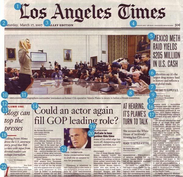
Wow…although I disagree with a lot of cartoon-syndicate man Daryl Cagle’s decisions, I agreed with his recent analysis of the front page of the LA Times. While I didn’t care to take the time to see if his font count is correct, I agreed that the front page looked like a mess, or as I’d like to put it, like a font book threw up on some newsprint.
Today, Cagle linked to a blogger’s dissection of his LA Times analysis (actually, Cagle claims he linked to it on March 20, even though what he’s linking to wasn’t even written until the evening of March 21). The blogger concluded that, while he agrees with the spirit of Cagle’s argument, Cagle was just flat-out using some incorrect information to make his case. And quite significantly, the blogger says
Given the snarky, nit-picky nature of the original critique, I feel it’s not out of line to examine these supposed 22 different fonts with the same diligence.
Well guess how the classy ambassador of his syndicate responded to that.
I’ve gotten reaction to my “Ransom Note” piece on the LA Times (below) from some of our more anal readers (my emphasis) who are graphic artists; they point out that some of the fonts that I have counted are not actually different fonts, but are different members of font families, such as: italic, extra bold, or condensed siblings with the same font surname. Here’s a link to some guy who thinks this is a very important distinction. I say, tell it to the pastor’s sister-in-law with the new Macintosh.
That’s right – in Cagle’s world, depending on things like facts means you’re anal. Pointing out that he’s wrong makes you anal.
I love that he called him anal. Because, you know, Cagle’s not. It’s not like he scanned in a front page, labeled 22 points on that page, wrote a couple hundred words about it and posted it. What the blogger did was so completely different and anal compared to what Cagle did.
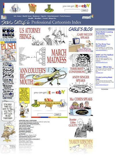
And as the blogger so beautifully points out, maybe a guy who’s going to claim that the LA Times is a visual mess resembling a random note…

…shouldn’t run a site that looks like this.

Sometimes it’s just better to admit when you’re wrong.
1 Response